Quick Config Tool
Even if an app is usable and delightful, no matter how well designed, it often doesn’t represent the entirety of a user or customer’s experience with a product or service. Sites and apps themselves are often just parts of the total solution. User Experience teams that can help optimize not just tactical screens in a UI, but also end-to-end experiences, can help increase profitable revenue and customer loyalty. This is what my team and I did with the telephony quick config tool.
Supporting customer business requirements and curating the UX requires understanding the different users’ journeys, from consideration through adoption or purchase, use, service, and support. Only then can we design and orchestrate the total experience a customer has at every touch point. UX teams think differently, and perceive obstacles and opportunities that other disciplines don’t. Likewise, product managers and engineers perceive obstacles and opportunities that UX does not. None of us can do it ourselves. When any of us gets arrogant and tries to do everything ourselves, it restricts dialog. What we want is open dialog and a recognition that the total experience does matter.
I have been part of teams that have been #1 in their markets, and part of teams that were on the decline. Teams that either were #1 or who later became #1 always had the same trait in common: Deep respect for and collaboration between one another (Product Management, Engineering and UX). Likewise, teams that were on the decline tended to restrict one another and listen to data that selectively optimized themselves, and not the product or organization. When we all optimize for the team and support one another, it tends to create a more successful product, solution and organization.
UX tends to introduce Design Thinking processes that focus on experience outcomes. Tim Brown highlights in his book Change by Design how design thinking can transform organizations to produce more profitable revenue, and increase innovation. So, the opportunity for UX is twofold: To design features we are given, and also to ensure we are solving the right challenge.
Curating the End-to-end Experience to Open a New Market: Example 1
In this first example, my team was asked to design software used to control IP phones. An executive on a cross-business-unit council inited me to participate in meetings where we learned Sales encountered challenges selling IP telephony solutions to small businesses.
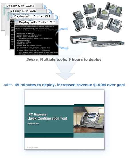
Thus, my team reached out to the field and conducted research to understand these challenges. It turns out that small businesses preferred to purchase complete solutions from resellers (we really did not know this previously). Resellers on the other hand needed to be able to deploy solutions in a couple hours, or they would begin losing margin. The challenge was that it took several days for resellers to deploy our telephony solution, which reduced their profit margin to zero. As a result, resellers chose to sell competitors’ solutions, even though they were less technically capable.
I presented these challenges to a cross-business-unit team of executives, along with two solutions:
- A quick config tool that configured all of the devices in a telephony solution, including a switch, a router, a PC running call control and voicemail software, and much more, then restarted all of the devices in the right order to ensure the solution functioned properly.
- Solution bundles, which decreased purchasing decisions from millions of options to seven (there were 12 routers models with 60 possible software versions, 8 switch models with 80 software versions, and other software with numerous versions, many of which were completely incompatible with one another).
In the end, my team took four people three months to design and build a tool that enabled resellers to set up our end-to-end solution in 15 minutes, instead of two days. It also resulted in $100 Million in sales over and above our financial goals, in just the remainder of the fiscal year.
Figure 1: Simplifying Deployment Increased Revenue by $100 Million Over Goal in the First Year Alone
However, after implementing this solution as a proof-of-concept, no one business unit would own the project and take it to market. As a result, I assembled the hardware and wheeled the solution into our cross-business-unit council of senior executives. I highlighted the challenges, then depicted our new solution. As part of the process, I asked our CMO as the least technically sophisticated person in the room if he would be willing to configure the solution. After some prompting, he did, and within 15 minutes, he had successfully set up a network that enabled him to place phone calls. The result? This executive council agreed to take this product to market. Within two months, it was on the corporate web site.
The point of this is not that UX solved the whole problem. We had to work cross-functionally, and truly it was a team effort. The point is that by leveraging design thinking in the overall process, we as a team were able to solve much higher-order problems than just designing tactical screens.
The VP who invited me to the cross-business-unit council and I met several years later at a party, where he said to me: “Jim— we only worked on three projects together, but each of those three was more fun and impactful than any other projects I worked on throughout my career!” That’s a great feeling.
Curating the End-to-end Experience: Example 2
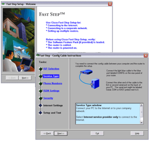
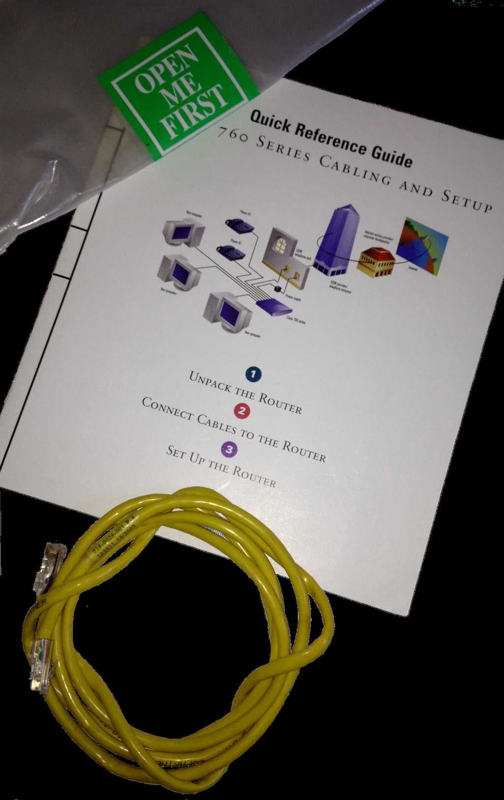
In another example, as one of my first projects ever I was asked to evaluate and give recommendations to improve the usability of one of our commercial (SMB) products. Initially, executives suggested we needed just a configuration interface. However, after a set of comparative usability studies, we found serious bottlenecks. Competitive products took only 35 minutes for a novice to deploy. Contrast that with our product: 0% of novices could successfully deploy the device, and only 50% of experts could configure our products in four hours. Users encountered challenges at every touch point, including identifying the appropriate cables and connectors, connecting them to the right ports, and then configuring the device. The accessory kit included 300 pages of reference documentation that none of our users found useful. In the end, we did design an application UI, but we also simplified the total experience at every other touch point as well. We defined standards for hardware, including industrial design, color-coded cabling, accessory kit contents, as well as documentation that have lasted nearly 20 years.
Figure 2: Configuration Wizard (Windows 95)
After implementing our recommendations, it took a novice less than 20 minutes from the time they began opening the box to the time they succesfully reached an external website. The SVP of the business unit said “Jim, I can’t say that our success was entirely due to your team. But, without the work you did, we never would have been as successful as fast.” In the end, entering this market when they did earned the company more than $2 Billion per year and provided a competitive advantage for many years. In this case, the experience itself differentiated even a highly technology-driven company.
Figure 3: Open Me First Bag, Color-coded Cables, and Quick Start Guide


