Complex Reservation App
In the article “Lean UX: Reduce Learning from Six Months to Two Weeks,” I highlighted how great UX leaders know how to research and build concepts fast, solicit feedback, and iterate. They create presentation-layer code in days or a couple weeks. They then gather insights from users in usability studies (both performance- and preference-based data), and get market-based feedback to ensure customers will buy the product. If the product has challenges, they iterate. By moving fast from concept to code, they reduce the learning cycle from months to days, and know they have a great product from the start, one that users love and are willing to buy. This article takes the wireframe vignettes (story) presented in the article “Wireframes Tell a Story” and presents the functional prototype that my team produced, based on cross-functional input and feedback. The screens in this article became the basis of the final product. We took this presentation-layer code (View layer in the MVC model) and connected it to the business layer (Controller layer), then to the back-end. Users and customers could interact with what felt like a real application. As such, we were able to both validate the concept in the marketplace, and validate the usability of our design throughout the design and development process.

When done right, producing the View layer takes 10% of the work required to build the full application. Let’s take the analogy of a spear: The presentation (view) layer is the tip. It looks good, but without the handle (the application back-end) to give it weight, balance, and the right trajectory, the tip makes no real impact. You need both the tip and the handle, and both require skill. One challenge with UX is that product managers and engineers often confuse the lesser amount of work with lower complexity and therefore a reduced skill set. Because they understand features and technology, they over-simplify the process of defining the experience outcome upfront, and over-think the features and technology too early in the process. But, as Steve Jobs said “You’ve got to start with the customer experience and work backwards to the technology.” The view or presentation-layer represents the final experience. Start with this result, with the intended experience outcome, map it through the presentation layer, then define technology and features to support the result. That is what we did with in the following example.
The Application
In this example, the screens represent exactly what a user would see in the final application.
Visual Design
Let’s start with the visual design—we had several goals; take a look at the screen below as you review these goals:
- Content is king: Remove any lines or extraneous elements that are not absolutely essential to helping the user find the element they need to interact with to perform a task. If there is an extra line, dot, color, grouping, or element, remove it.
- Honest and simple: Remove unnecessary skewmorphisms, because these draw the eye to the style, rather than content.
- Flat: Even back in 2012 when we developed this application, when Apple and Microsoft were still using gradients, we implemented a flat design. Fundamentally, gradients draw the eye to themselves unnecessarily.
- Clear visual hierarchy: It is clear to the user when they first encounter this page what the key elements are, and where to look for what kinds of information. Moreover, the hierarchy, or relationship between elements is clear, and group elements that are all part of a larger context.
- Progressively build to complexity where required: There are times when workflows are inherently complex, even after you simplify them as much as possible. When this happens, start simple, and add elements over time, so the user gets used to the baseline, and then sees only the necessary incremental elements. Cognitively, start with what the user knows, and build on that.
- Maintain context. Ensure the user is always oriented, even if they have multiple sessions and multiple tasks going at once. If the user looks away and comes back, make it easy to see the point of focus within two seconds.
- White-labelable: Make sure the colors and logos in this application can be easily replaced with other brands, so we could sell this application to multiple customers, and easily customize it to each.

Application flow
The following sections highlight the application flow for a single scenario- a customer Judy Meyer, who is a Gold Tier customer with FlyAway Airlines. Judy has different needs when she flies for business versus when she flies with her family for leisure. The system allows the agent to select the appropriate profile quickly, which auto-populates the appropriate fields with the correct parameters. Of course, the agent can still change these parameters if the passenger chooses.
Judy Meyer Calls the Reservation Center
In the screen above, you can see that the reservation’s agent is on the phone with a customer, Ms Judy Meyer.
Reservation Agent Selects Profile and Destination
In the following screen, the res agent (Chris Childress) has selected Leisure Travel Preferences for Ms Meyer, who indicated that she wants to take a family trip (with her husband and daughter). Because the system stores both business and leisure travel preferences, when the agent selected Leisure, it automatically selected the class of service “Premium Economy” and because their dates are typically a bit more flexible, the system will check for flights two days before and two days after the target dates, to provide flexibility. Had Ms Meyer said she was on a business trip, her preferences would have given her Business Class by default, and would only find flights on the exact date provided, because her business schedule is typically inflexible. These were Ms Meyer’s preferences, and they are changeable in preferences. They could also be overridden by the agent booking the trip, but tended to speed the process of booking.
Note also that the agent selected Round-trip, a starting point of PHL, and a destination of LHR, plus 2 adults and one child.

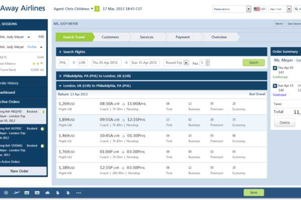
Search Results Screen
In the Search Results screen, we changed it to show the top breadcrumb Search Travel highlighted. We also wanted to retain the user’s context:
- We summarized their original search parameters inside of a collapsed container, which they could change
- We showed each result inside of a container that could be minimized if the agent wanted to see an overview of multiple legs of a trip at once (especially useful on complex itineraries)
The screen shows all options for each leg of the trip. Note that if the agent hovered over any class of service for a trip, an overlay appeared, showing the price.

Selecting a Flight and Having it Show Up in Order Summary
In this screen, the agent selects a flight, and the system shows the total cost of the items selected thus far.

Selecting a Return Flight
In this screen, the agent selects the Return flight, and that shows up in the Order Summary on the right. This follows the initial concept that screens become more complex one item at a time as the user progresses through the work flow. In addition, the left of the screen, shows all active orders, with the current order highlighted. In terms of visual hierarchy, you can see that Chris Childress is waiting on Ms Judy Meyer, and is creating a trip with booking reference REQYYD.

Confirming Passengers and Seating
In the previous screen, the agent had clicked either Book, or clicked directly on the Customers breadcrumb, either of which would take them to this screen.
In this screen, Chris Childress verifies that the people traveling with Judy are Jack Meyer and Rebeccah Meyer. Because they were listed in her Leisure profile, they were automatically added. Of course, Chris could remove either or both with a single click, or add a different passenger. She clicks either the Next button at the bottom of the screen, or the Services breadcrumb at the top.

Adding a Tablet Rental
Because airlines need to earn incremental revenue through add-on merchandise and services, Chris asks Judy if she wants to rent a tablet on which they have games for kids, along with music and the latest movies, for her daughter. Judy agrees, so Chris adds a tablet rental for both the outbound and return flight. The agent, Chris, then clicks Next to go to the Payment screen.

Paying for the Flight
The Payment screen appears. It shows the itinerary and the costs, and shows the default of Judy Meyer paying.

Adding a Form of Payment
Judy wants to pay $5,000 with her personal MasterCard, so the system shows on the right that there is still a balance of $6,062.

Adding a Payer
Judy decides to add her husband Jack as one payer, and to use his Visa to pay for the remaining $6,062, leaving an amount of $0 remaining. Note that this all seems simple, but is much, much more complex than this today. There is no way to split out costs and payment within any existing system today.

Reviewing and Submitting the Itinerary
In this screen, the agent reviews the itinerary with Ms Meyer, and enables Ms Meyer to receive her itinerary and receipts via email, US Mail, or (if she were at the airport) printed and handed to her. Ms Meyer prefers to receive her documents via email, so the agent clicks Email, and clicks Print and Send.

Summary
The screens in this scenario represent one workflow, but of course the prototype itself supported many possible scenarios and workflows. Once we had the basic prototype complete, we were able to validate and iterate it based on user feedback to ensure that it was both usable, and that it delighted its users. For more information, as always, feel free to reach out to me.
