Mobile Travel Apps
Mass exposure to instant, elegant apps has driven users of every demographic to expect simple, useful and delightful apps, whether consumer or enterprise products. This is especially true of mobile apps. In my UX Design Studio for Consumer Travel, research suggested that airlines needed two applications, both of which would work support user tasks best in a mobile format:
- A Check-in application for airline agents standing in the airport
- An in-flight entertainment app for consumers to use while in flight
We therefore designed these apps based on three key principles:
- Mobile first
- Highly useful and delightful
- Minimalism. Simple and focused on mobile interactions
Creating apps for mobile first required we clarify our focus and simplify the experience in ways we would not have considered had we designed for the desktop first. Designing for mobile first brought us a laser focus to simplify the experience, to reveal only the core functions that are relevant in specific contexts.
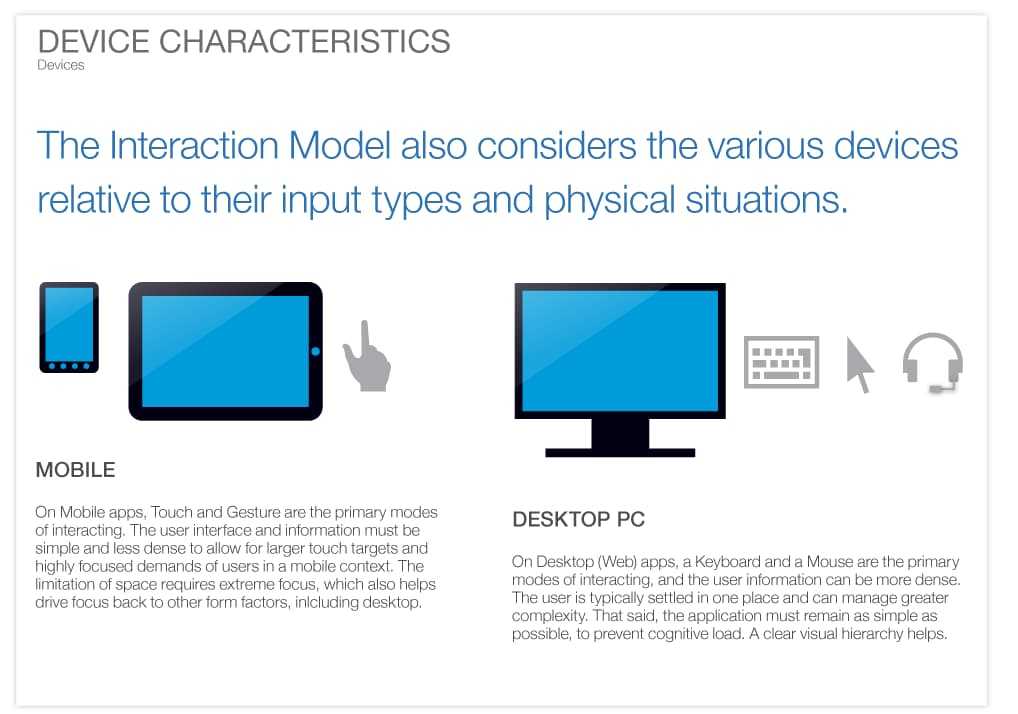
We looked at some key examples. Take email for instance (a dying modality?). In a mobile context, we mostly read and send terse messages- we have very targeted interactions. Contrast that with the desktop, where we have access to more, including filters, calendar, notes and so on. In mobile, each function is a separate app: Email, Calendar and Notes. That said, we identified specific differences between mobile and desktop.
These principles seem obvious today. Mobile apps must be hyper-focused on their core purpose. However, when we designed and built these apps in 2013, teams were still creating large, multifunction apps for mobile. We decided to buck that trend, and our bet paid off.
That said, a number of teams today design and build traditional desktop applications first, then craft mobile experiences as an add-on. However, going from desktop to mobile in most cases requires completely rethinking the purpose of the mobile app. It truly is easier to do the hard work of starting with mobile and taking our insights to inform the desktop design.
As the leader of the UX Design Studio, I functioned as Creative Director for the teams designing and prototyping these applications.
Check-In Application
The Check-In application turns an airline agent standing behind a desk into mobile concierge, who provides a high-touch experience. Airlines had a hard time expanding and contracting from peak to low season and back, and paid a significant amount for extra desk space in the airport. At the same time, these airlines had plenty of agents at the airport. Their challenge with checking in passengers faster was desk space. The mobile concierge concept had the potential to improve the travel experience by decreasing time to check in and increasing human contact for those who wanted it.
To be effective though, a mobile concierge must be able to do several things quickly, while talking with a passenger: Find flights and look up customers, indicate the number of passengers traveling together, tag luggage, sell amenities, change seats, accept multiple forms of payment, and to print tickets and receipts.
In the end, we simplified and optimized the experience so a mobile concierge could check passengers in faster than agents standing at a desk using their old systems.
We conducted research, designed the app, made it white-labelable by multiple airlines, and built a fully functional prototype working on mobile devices in six months. Our ability to move rapidly secured partnerships with a number of airlines, who partnered with us on this initiative and several innovation efforts going forward. It opened a $100 Million sales pipeline for the organization.
In-flight Entertainment Application
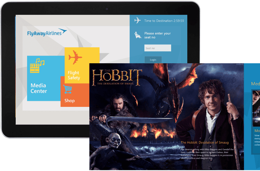
Airlines also needed to find a way to be able to evolve their in-flight entertainment offerings, including no longer installing expensive and heavy video equipment in each airplane. Rather, they wanted to offer an app that could run on a mobile device. First class passengers would be handed a tablet, while other passengers could run the app on their own device.
We adhered to the same principles as for the check-in app, and also agreed that we needed this app to have a high contrast ratio, so entertainment could be seen in either dark or bright ambient light.
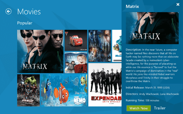
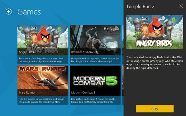
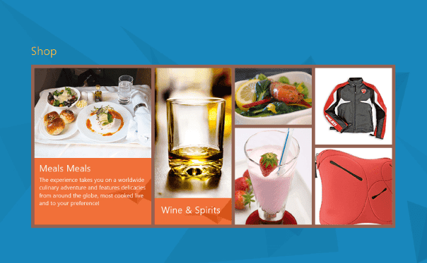
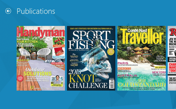
The application needed to have several categories, in addition to just entertainment, including games, merchandising and publications for reading. Here is a subset of these screens:
Movies
Games
Merchandising
Publications
Making Each Application Brandable
Finally, we also created a cabin-crew application that enabled flight attends to:
- recognize and reward loyal and high-value customers
- sell merchandise with ease
- access information about other crew members flying with them
- view forms, manuals, and training materials
We made these applications white-labelable (brandable), so any airline could brand the apps as their own.
If you’d like, just ask, and I’ll show this application as well.
