New App Interaction Model
When I joined HP to lead the UX Studios for Consumer Travel, my goal was to design products that transform the future of travel. Unfortunately, I had to throw existing designs away and start from scratch. Why? Existing designs did not follow a cohesive interaction model- a design model that binds an app together so it supports the conceptual models of its target users. It ensures users are always oriented and that they can predict how to take actions to achieve their goals.
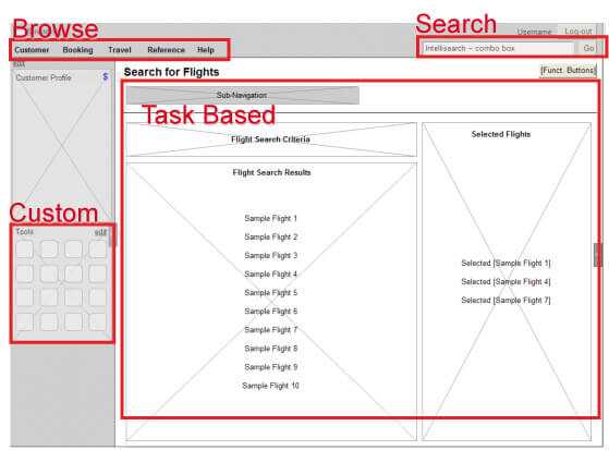
Initially, the application screens were all based on a single master page template, which meant that every design had to fit within a specific structure, regardless of task. Moreover, the application was broken into tabs, such that any given role had to select a tab to have access to their tasks. Unfortunately, tabs did not offer a logical or parallel structure. Such a navigational model could work fine for an informational site, but not for an application that needs to make airline agents efficient. Finally, to adhere to the master templates, designers had to nest key functionality two layers deep, which in most cases made no sense. The fact is that different users had a very different conceptual model of the tasks they needed to perform.
Figure 1: Master Page Template- An Example of Poor Design
However, we needed to identify the conceptual model for each user, and craft an interaction model for the app that supported these conceptual models. Let’s step back and address some key questions:
- Why can’t a team just use a master page template for their designs?
- What is a conceptual model and an interaction model?
- What did our interaction model look like?
Why Not Use Master Page Templates?
I often hear people—even experienced designers—suggest that they can quickly create a global template or an information architecture, and then begin designing. Now, if they’re designing the simplest of Web portals, they may be right. Global templates are akin to style guides that strictly enforce exactly where every element goes—not just on one page or screen, but across many of them. Style guides and UI standards and style guides can actually reduce the likelihood of producing great design. As Jared Spool highlighted at SXSW 2011 in his presentation “Rule-based Decisions versus Informed Decisions,” UI standards and guidelines are essentially rules that teams must follow regardless.
The challenge with rule-based design is that it fails on any exception cases. Of course, design is all about solving real problems (where exceptions are the rule!). Style guides do not work to promote great design, because every design is by definition different. Every design solves a different problem, and therefore should have a different solution. Unfortunately, business leaders often ask me to create style guides, and we have known way too many designers who still believe that producing and following style guides can deliver great design. Here is another example of where we differ as an industry, and need to start coming together with a single answer. It’s a black-and-white case: Style guides are bad. Pattern libraries, when implemented correctly though, can enhance the quality of design. An interaction model, on the other hand, is more like a design pattern and design principles that describe the ways in which objects relate, with many sub-patterns that together describe the model. The difference is that interaction models leave room for designers to solve users’ real problems, which is in fact the very purpose of Interaction Design.
What is a Conceptual Model and an Interaction Model?
A conceptual model represents the mental framework from which a user approaches a task or goal. We can see conceptual models in action when we consider a few Microsoft Office products:
- Microsoft Word reflects and supports the conceptual model of a person who inserted a piece of paper into a typewriter in portrait mode. The user can simply type and produce an artifact, such as a letter. Of course, they have a significant amount of value-added features.
- Microsoft PowerPoint on the other hand, supports the conceptual model of a person who wrote on a clear plastic sheet—typically in landscape mode—and set it on top of an overhead projector. Of course, PowerPoint also has additional value-added features.
- Microsoft Excel supports the conceptual model of an accountant working with rows of entries and columns of numbers. Again, Excel also has additional value-added features.
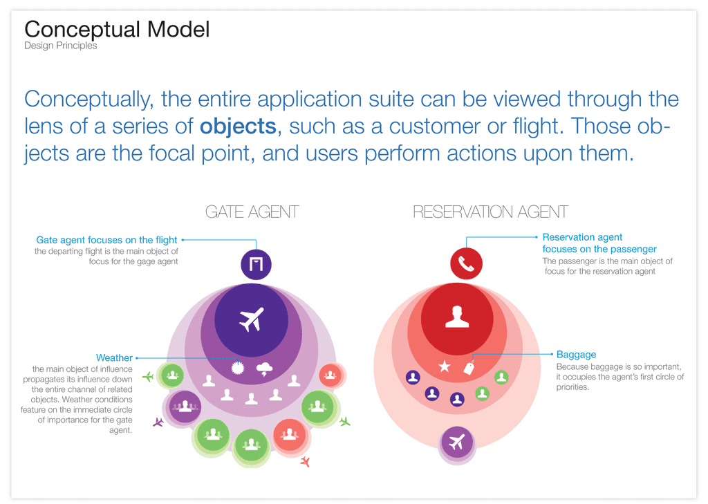
Figure 2: Example Conceptual Models for Different Airline Agents
The interaction model (IxD Model) for each of these applications differs in the right way—to support the conceptual model of users performing different tasks.
Thus, these concepts are highly practical, though they might at first seem unnecessarily cerebral. If you don’t understand a user’s conceptual model, you can’t define an IxD model that supports and enhances their experience. At times, we invent new ways of interacting, but more commonly, new interactions reflect real-world interactions. Even the swipe to unlock model follows a natural affordance.
What Did Our IxD Model and IxD Guide Look Like?
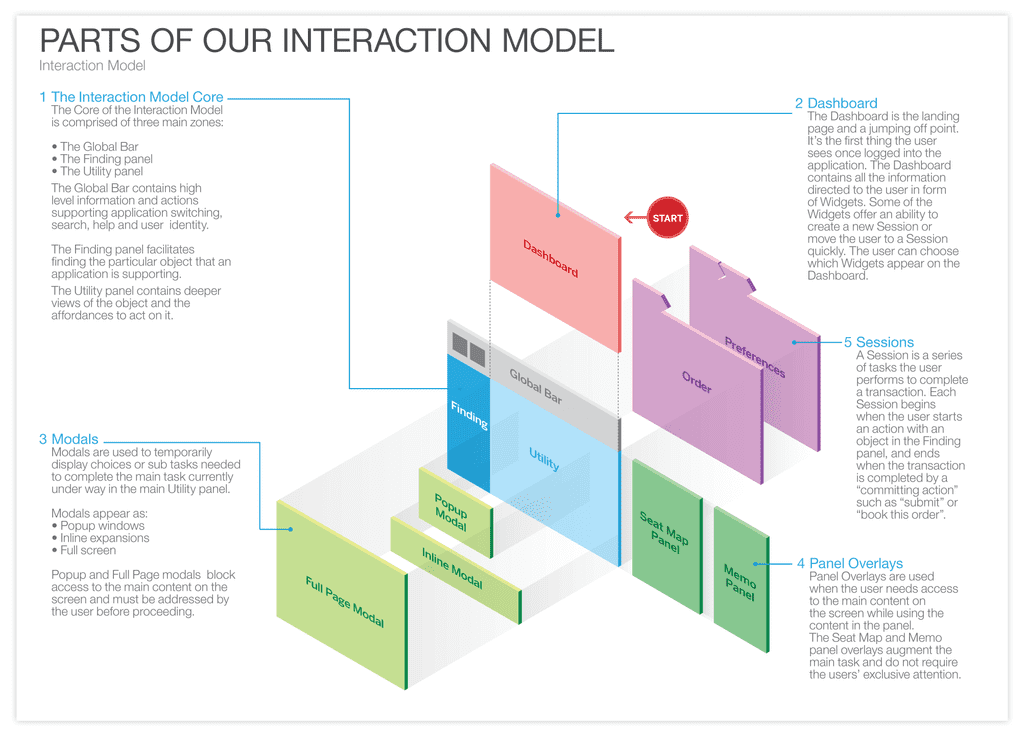
Note that we created an 11” x 17” booklet that we could hand to customers, developers, product managers, and anyone else who needed to understand our customers’ mental framework for approaching their tasks, and the UX architecture we would follow to support their tasks in the most natural way. Here’s one page from our 110-page IxD Guide, highlighting the basic Interaction Model for this family of products:
Figure 3: Basic Interaction Model for a Family of Products
An interaction model then defines how all of the objects and actions that are part of an application interrelate in ways that mirror and support real-life user interactions. It ensures that users always stay oriented and understand how to move from place to place to find information or perform tasks. It provides a common vision for a portal or an application (desktop or mobile), including the types of attributes that are appropriate for each.
It enables designers, developers, and stakeholders to understand and explain how users move from objects to actions within a system. Defining the right interaction model is a foundational requirement for any digital system and contributes to a cohesive, overall UX architecture.
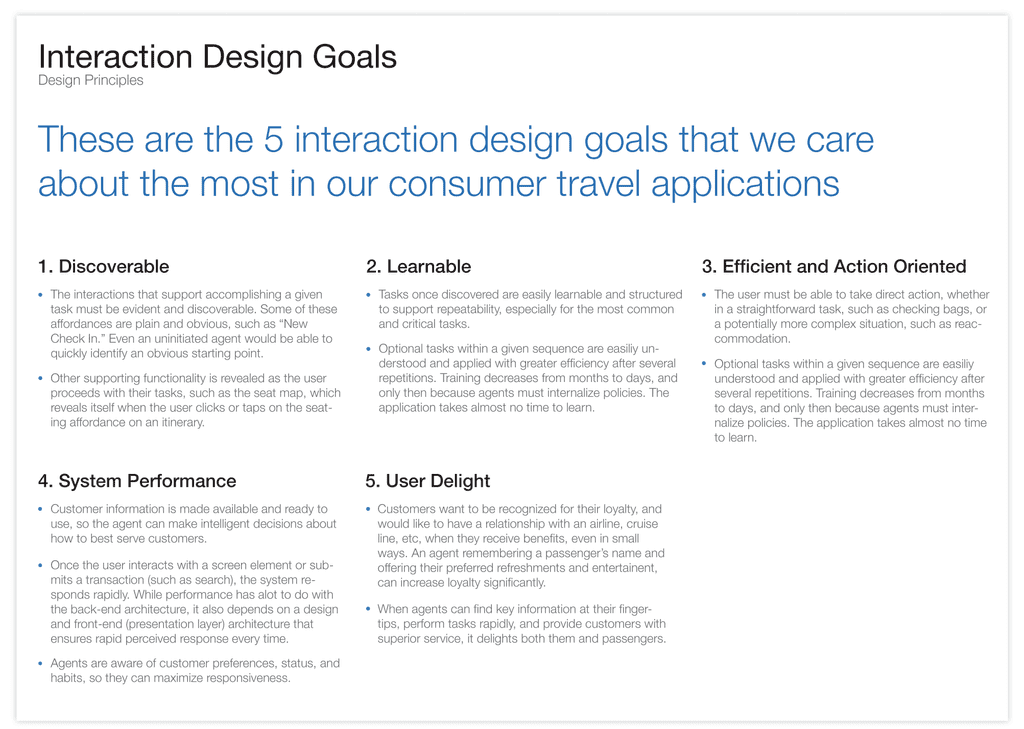
The interaction model is something that users internalize, but probably could not articulate—and wouldn’t care whether they could. Users internalize well-constructed interaction models, which make most actions within a system more predictable. Just as the book The Invisible Computer suggests, we often don’t notice a product or application when it works well. Clearly, then, there is no one-size-fits-all interaction model. Every product solves a different set of problems for different users, and therefore, requires a model that, as much as possible, reflects and supports their real-world interactions. Therefore, just as we defined the users' conceptual models, we also identified the top goals for the interaction design.
Figure 4: Example Interaction Design Goals
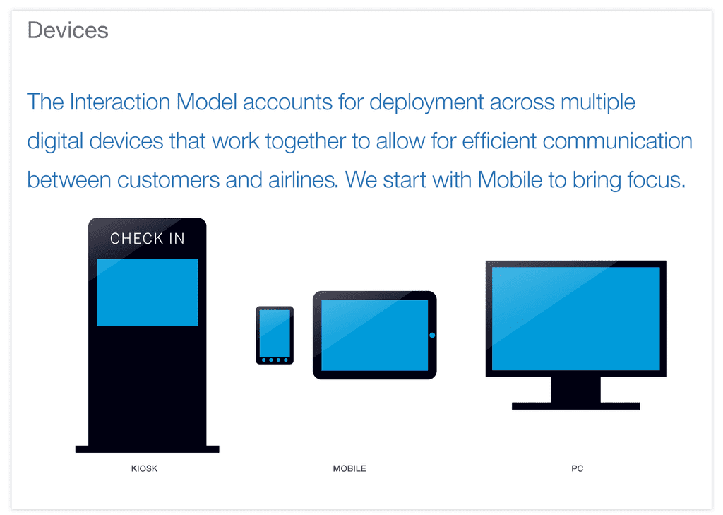
An interaction model also describes the types of affordances to present in the application. For example, should a PC-based (non-mobile) application use more Web-portal affordances or desktop-application affordances? In our case, we decided to start with mobile first, to help bring focus and prioritize capabilities. But, even when moving from mobile to desktop, we don’t leverage the design exactly as presented on the mobile. On a mobile device, we have what we call guided mode, which includes only the key capabilities required to support a focused mobile experience. In Desktop applications, we leverage the entire desktop in more of a palette mode.
Figure 5: Types of Interactions Define the Types of Affordances
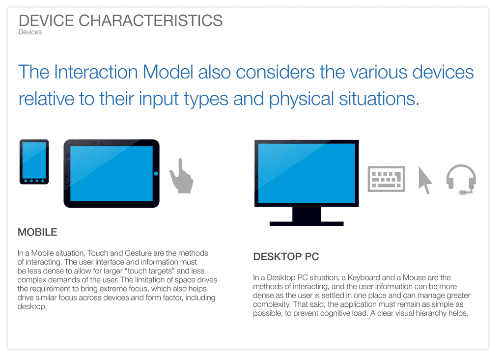
Take email for example. On the desktop, in addition to reading messages, you can set rules, view calendars, notes, contacts, and tasks. On a mobile device (particularly a phone, which is the predominant mobile device used) we typically read and respond to email, but do less setting up of rules, organizing mailboxes, and so on. Therefore, the mobile email client can (and should) be more focused. However, they can follow the same basic interaction model, and should, to ensure the applications are predictable (not consistent, but predictable) across devices.
Figure 6: Device Characteristics
Thus, for our travel applications, we decided that even our Web applications would use only application affordances. At the simplest level, it would minimize use of underlined links and use more buttons. It would have a Maximize/Restore button that eliminates or restores the browser chrome, enabling the application to take up 100% of the usable space on the screen, similar to that on Cooliris, for example.
I have seen many UX teams with significant design skill craft applications that were not consistent in their affordances. Should they leverage web portal affordances? Web app affordances? Desktop affordances? Mobile affordances? The upshot for us was that, though we were designing the technology to be highly performant, for our web-app version of the product, we chose a desktop application metaphor. At times, it doesn’t matter what model you choose so much as just choosing a model and sticking with it.
How, then, do you define an application’s interaction model? It can take months, but in the end, when stakeholders look at the model, they typically say, “Of course! I get it! It’s simple!” In this way, defining an interaction model is not unlike complex mathematics. You expend effort to figure it out, but once you understand the model, it seems so simple, and you wonder why it took so long to understand it in the first place.
Defining our interaction model for consumer travel products took me a few months of user observations to understand how users conceptualized their goals. I also internalized how they thought about objects supporting those goals, and the actions they performed using those objects to achieve their goals. On this particular project, we’re designing consumer user interfaces for mobile, tablet, and the Web, as well airline agent user interfaces for the Web and tablet.
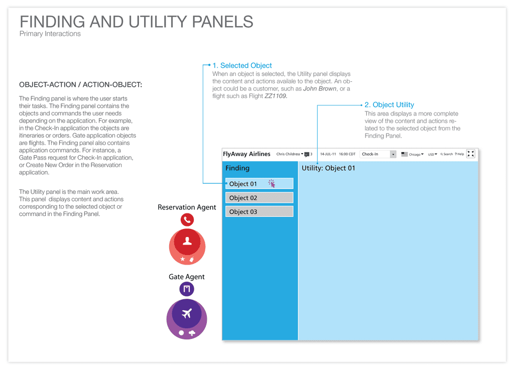
When focusing on agent interactions, we recognized that each type of agent had a different primary object for which they needed to solve problems. As we saw in the first image of the conceptual model, reservation agents taking calls to book a new flight or change an existing flight are focused on a customer who is on the phone. They need to solve problems for customers, such as booking a flight or changing a profile.
On the other hand, gate agents at an airport have a different goal, which they call closing a flight, and, thus, a different primary object on which they focus. Their supervisors measure their performance based on their ability to close flights, or get their flights away from the gate on time. Gate agents have several activities going on at the same time—all with a focus on getting a flight away from the gate on time. They need to make sure the passengers all have seats, award some upgrades, accommodate those on a waiting list either on the current or a later flight, and so on, but all of these activities are in service of closing a flight. Most of the gate agents I have observed care deeply about serving their customers—even if we don’t recognize it— but their continued employment depends on their getting flights away from the gate on time.
Here is how we translated the conceptual model into an IxD Model:
Figure 7: Basic Foundation of Our Interaction Model
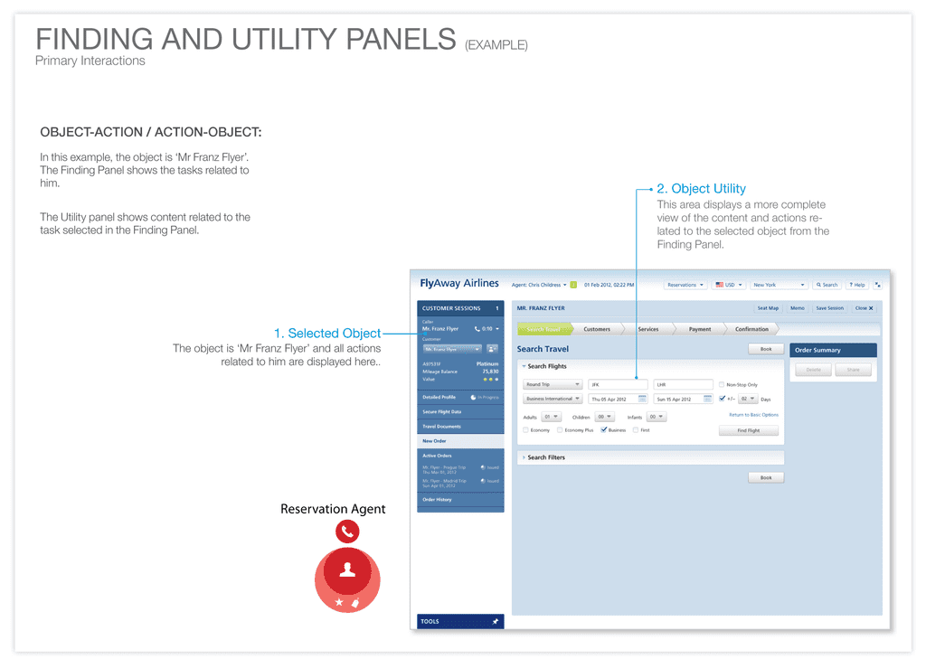
Here is an example of how the interaction model applies to a Reservations Agent.
Figure 8: Example of an Interaction Model for a Reservations Agent
In the end, designers were able to easily internalize the design patterns required to design a highly usable, useful, and delightful application for each user. In addition, the IxD Guide helped engineers and product managers also internalize and articulate how the application worked or needed to be assembled to support different users’ goals. In other articles, I highlight specific screens in greater detail, including the workflow for different user roles, as well as branding for different airlines and third-party travel companies. As always, contact me if you have questions or have something to add!
