Recruiting App Redesign
When we started this project, the CMO told us she needed someone who her VP of UX could learn from, in order to help the team design experiences that differentated. The company had a 12-person UX team and had invested in marketing to drive people to their site. Their initial acquisition funnel looked OK, in that a sufficient number of users signed up for a free trial. However, most dropped off the free trial before paying a subscription fee for the product.
We conducted qualitative user research and identified several key insights:
- Their call-to-action, which was “Post your job to 100s of job sites with a single click” initially sounded good to recruiters. However, they received at times thousands of resumes, 90% of which were from completely unqualified candidates. Instead, they wanted maybe 50 to 100 resumes from highly qualified candidates.
- Companies in the range of 30 - 100 employees would use this sort of tool.
- Companies ranging from 100 - 400 employees might use this tool, if it could integrate well with their existing Applicant Tracking System (ATS)
Our more quantitative research found that:
- The existing calls to action on the marketing page were confusing
- Over 90% of users were not able to do the work that would have helped them attract more qualified candidates, because their acquisition funnel had:
- confusing calls to action
- a lack of focus that overwhelmed them
- an unclear visual hierarchy
One user said “going through this is like [experiencing] death by a thousand cuts.”
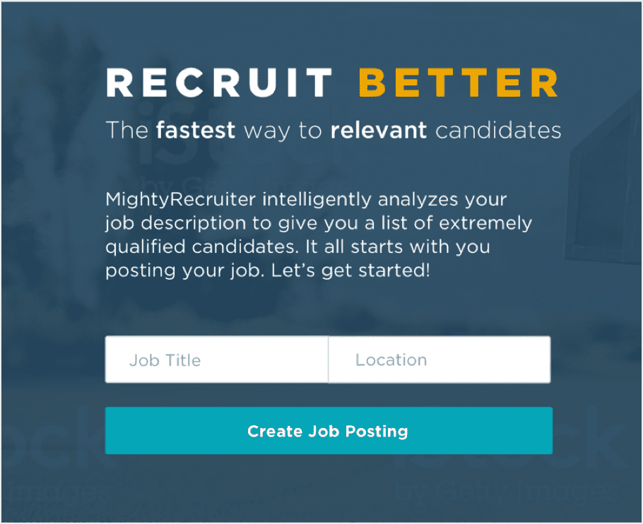
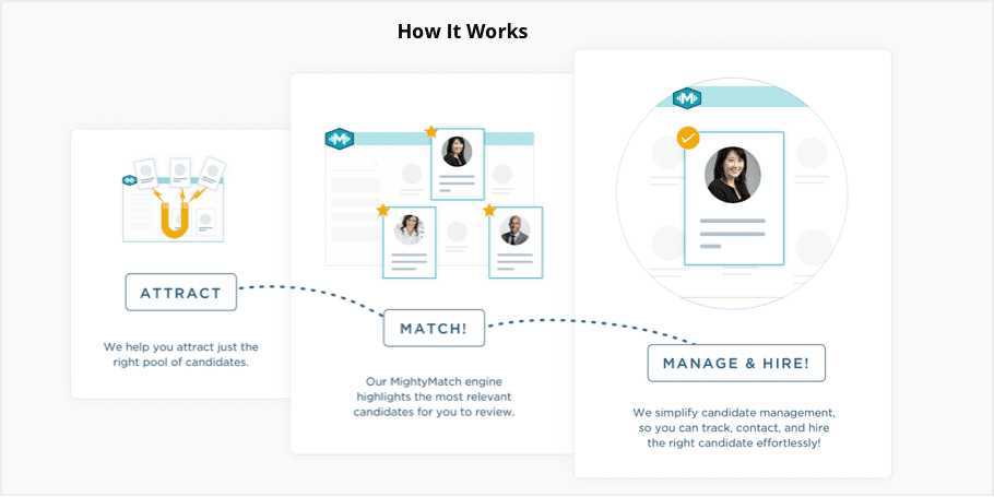
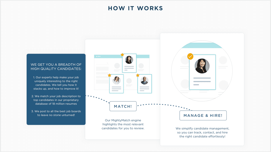
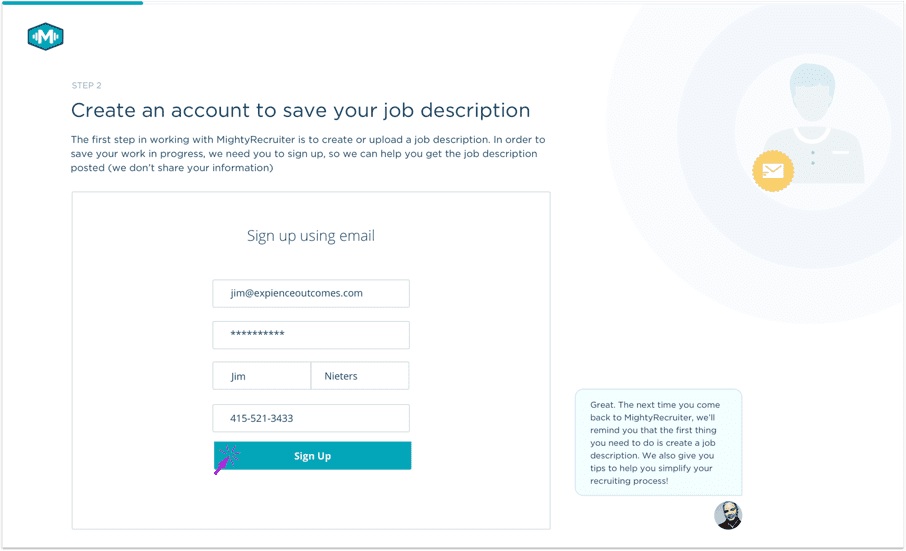
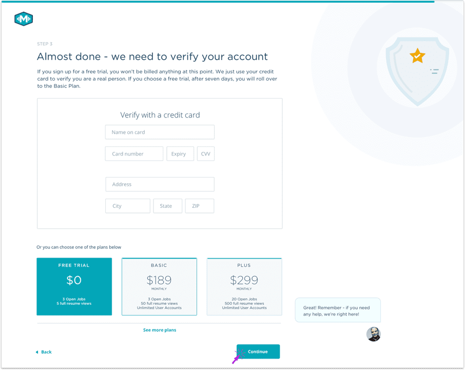
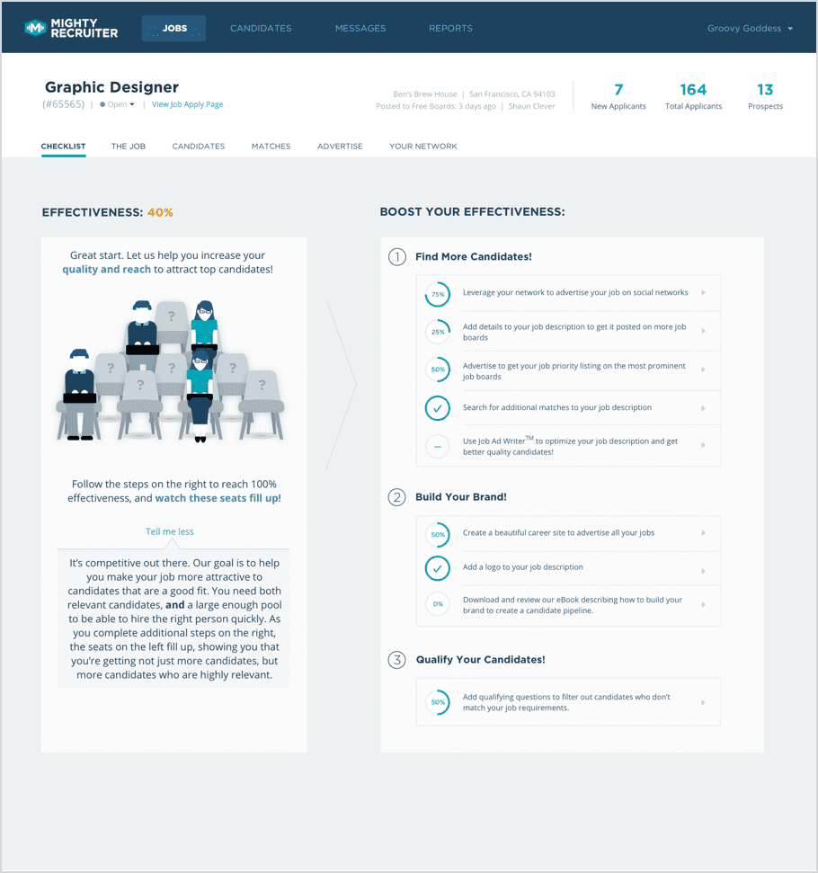
Thus, we helped them redefine their focus and personas, decrease and simplify their calls to action, and we redesigned both the Marketing pages and their acquisition funnel, to gamify it and progressively reveal greater value at the point of need.
We also helped them redefine their roadmap. For example, instead of adding features that existing ATSs already had, they could create an algorighm that would enable them to do automated matching of candidate resumes to open positions, thereby increasing the quality of resumes.
Here are screens that show the new marketing page, signup pages, and landing page to increase the quality of applicants.
