Visual Design for Mobile
Visual designs don’t come fully formed, even from the best visual designers. They require exploration and inspiration in a collaborative format that produces truly inspiring results. At the UX and Innovation Studios, we engaged in ideation in the same way as the best agencies. We conducted research (primary and secondary), defined tone, identity, personality, and language, and then apply shape concept and shape abstractions to form mood boards. We then compared potential concepts before arriving at our final visual direction. It sounds theoretical, but it is anything but. It is a deeply practical exercise that turns commoditized products into solutions that increase margins and long-term stock value. The right visual design exercises create differentiation.
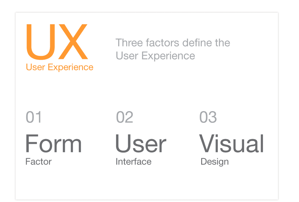
For this visual design exercise, we decided to evaluate three characteristics that define the user experience: The mobile device form factor, the user interface or interaction design, and the visual design. You do not want to look at these factors in isolation, nor do you want to get locked into a single form factor. Our goal was to ensure scalability across multiple form factors, and to enable the visual design to be adapted to different brands. The next four screens summarize how we approached each of these three factors.
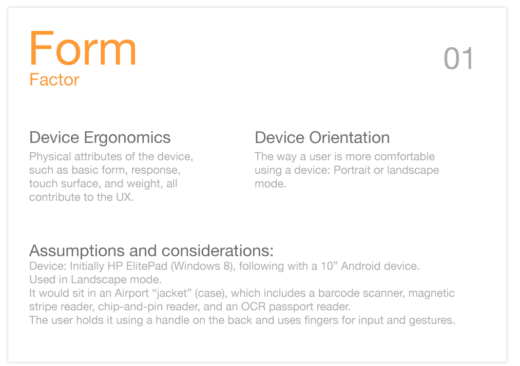
Factor 1, Form Factor
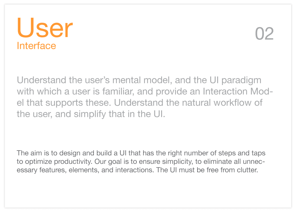
Factor 2: Understanding the user’s conceptual model, and identifying the right UI paradigm
Factor 3: Visual Design Language
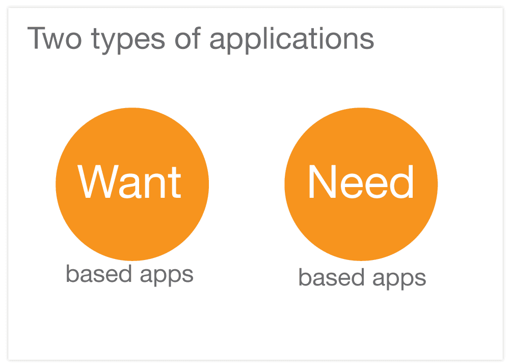
Defining a Visual Language for Need- Versus Want-based Applications
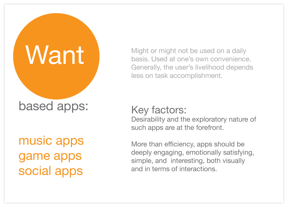
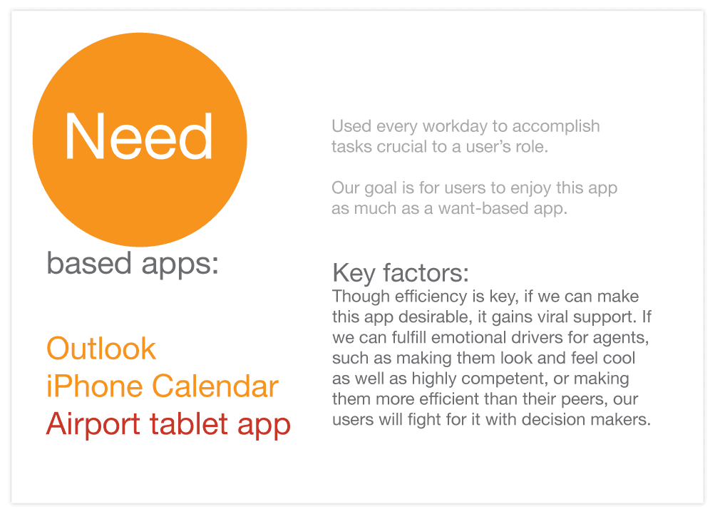
In considering how to approach this application visual design exercise, we had to evaluate the differences between “need” based applications, and contrast thos with “want” based applications. In the end, we need our users to form an emotional connection with the product, to feel that it makes their lives easier, makes them look and feel both cool and highly competent. Just designing your typical application look and feel no longer suffices. The application has to delight, and solve the business problem in the optimal way.
Want-based Applications
Need-based Applications
Primary and Secondary Research and Insights
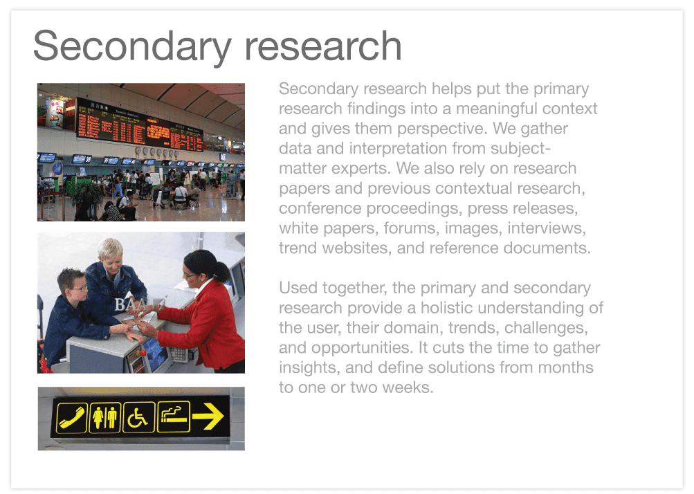
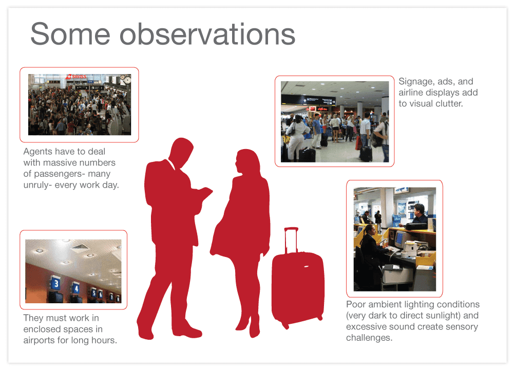
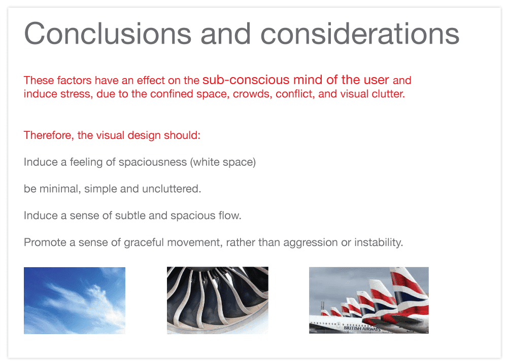
As we considered the visual design language for this set of applications, we leveraged lean ethnography to gather data rapidly. For more insights about this process, refer to my article User Research and Visualization in the Lean UX World. As we gathered these insights about the user’s mental model, we were able to form the basis for an Interaction Model, which binds an app together so it supports the conceptual models of its target users. It ensures users are always oriented and that they can predict how to take actions to achieve their goals. For more information about IxD modelling, refer to my article about defining an interaction model for a family of products.
Primary Research
Secondary Research
Key Observations
Key Considerations from User Research
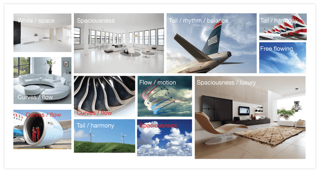
Moodboards Prepared to Evaluate Visual Design Concepts
Moodboards highlight a team’s inspirations for the tone, identity, personality, and language that defines a visual style. In some cases, as in this example, we simply look at inspirations that support our primary and secondary research. In other cases, we might explore different aspects of tone, identity, personality, and language. The team would create exploration statement, such as “What if Apple designed an enterprise application,” “What if Frank Gehry designed a business dashboard,” or “What if Porshe designed a reporting tool?” As we explore the identity, our mood boards might show mash ups based on these exploration statements.
For personality, the team might agree on a set of personality types (such as “The Innovator,” “The Architect,” or “Sports Car.” Designers would then ideate on traits of each of these personality types. For example, the innovator might have these traits: Inspirational, ambitious, simple, consistent, future thinking, flawless, clean. The sports car might have thest traits: Fast, contemporary, fun, sexy, proud, envious.
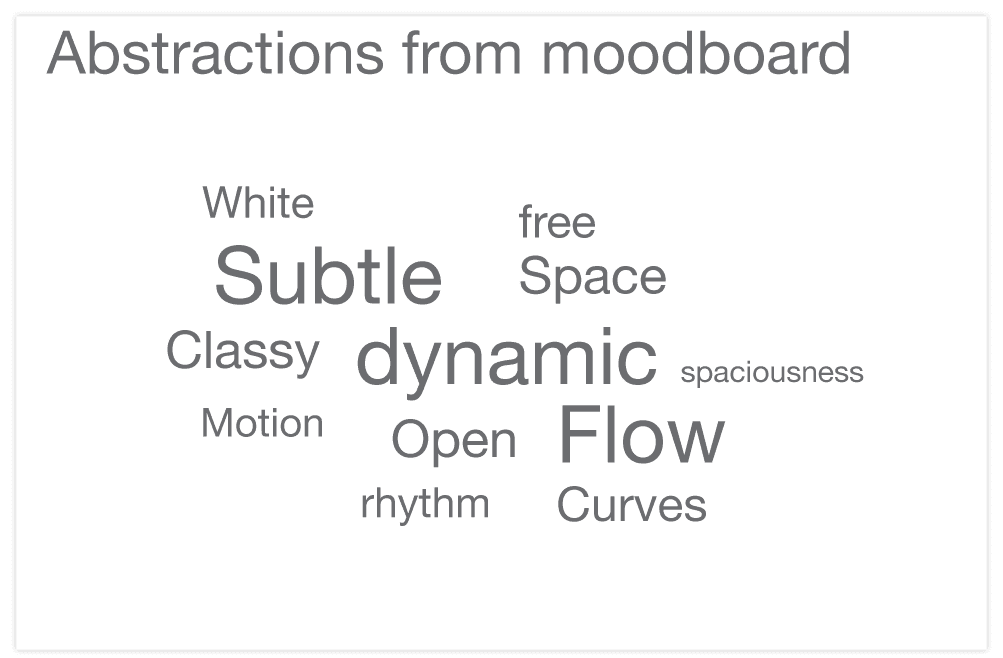
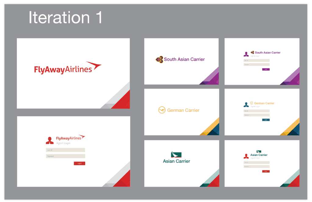
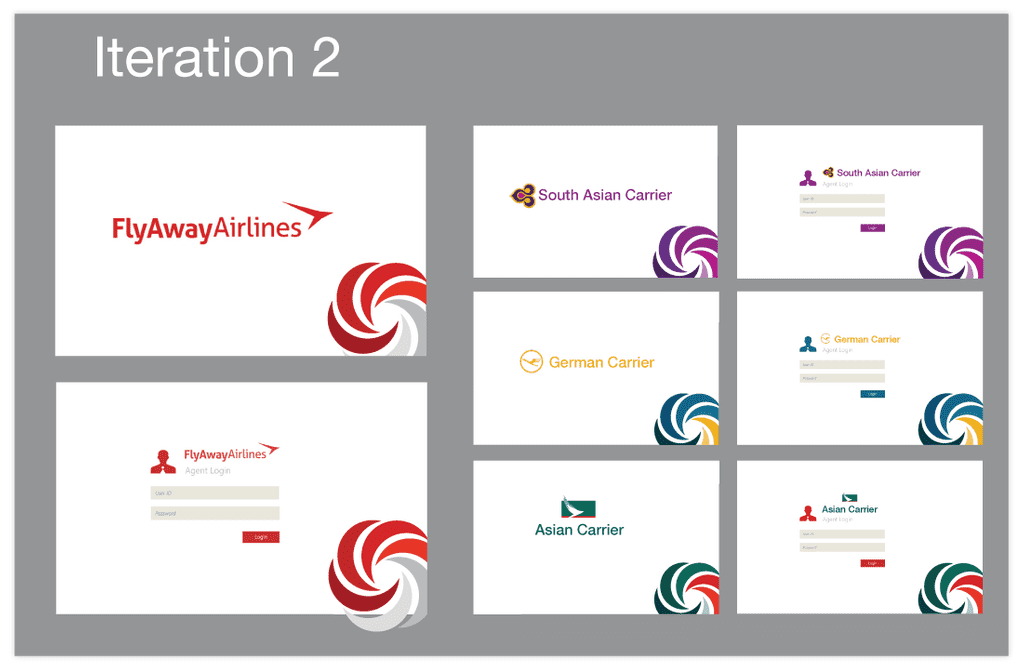
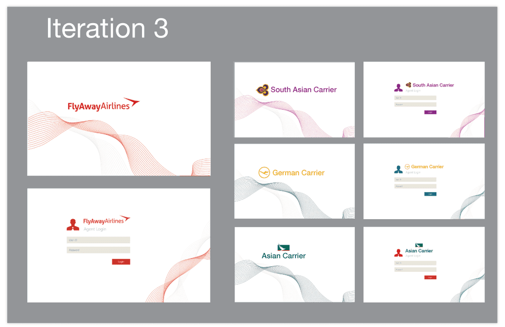
We then expore different abstractions from the mood boards, including shapes and colors, then review different iterations. We then select an iteration, and show it in a final design, as in the screens that follow.
Concept Abstractions
Based on the factors highlighted in the mood boards, the team defined some concept abstractions.
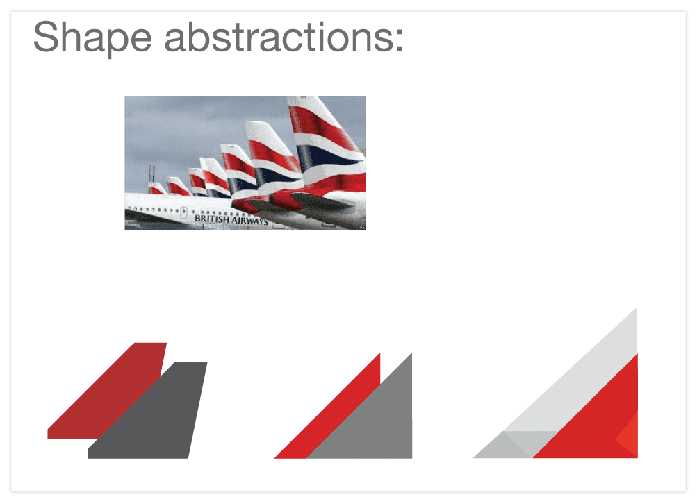
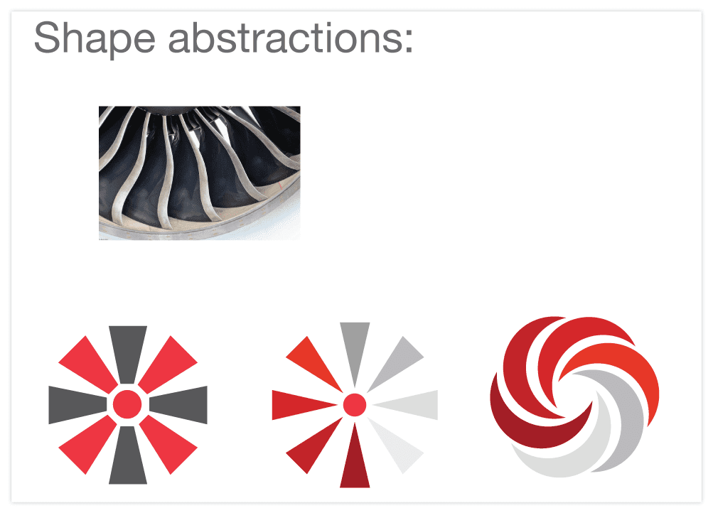
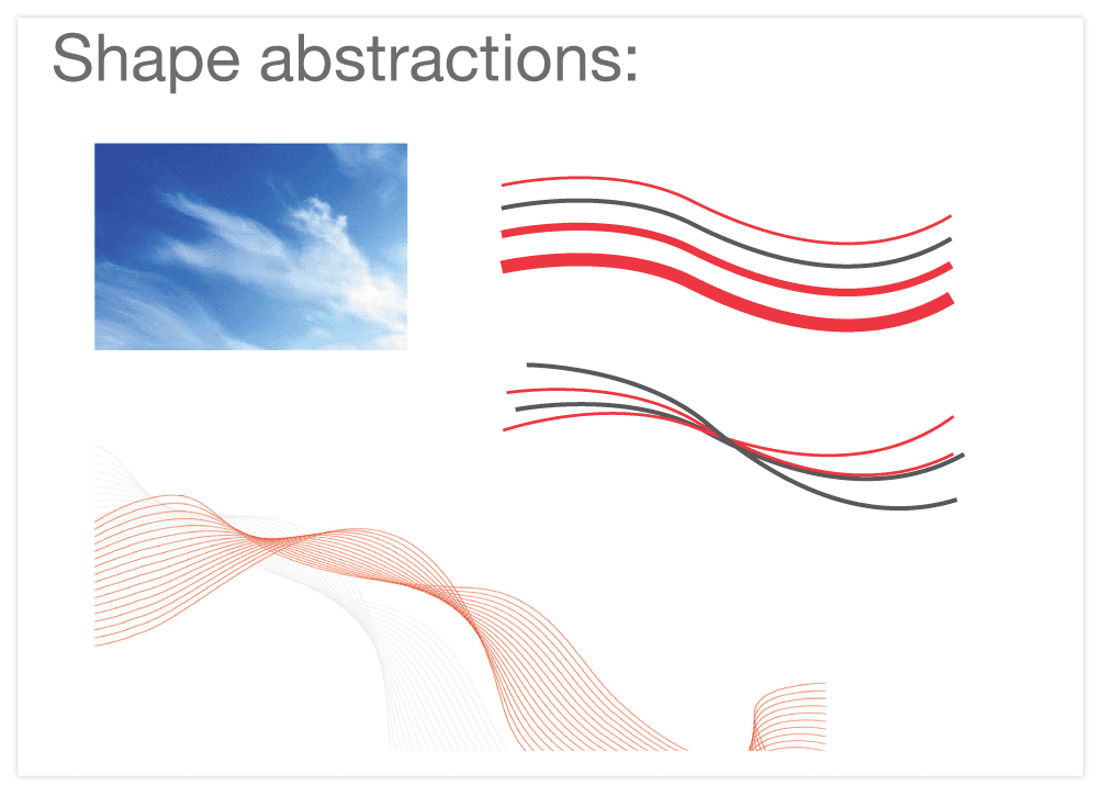
Shape abstractions from mood boards
The team explored three shape abstractions that appeared in the mood boards.
Shape Abstractions- Option 1
Shape Abstractions- Option 2
Shape Abstractions from Mood Board- Option 3
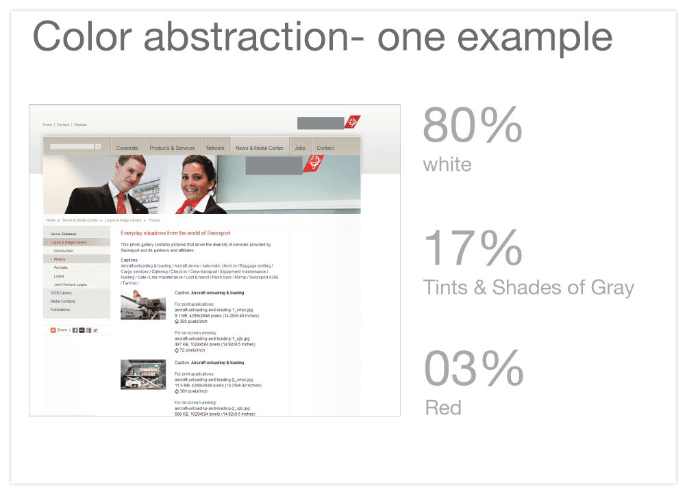
Color Abstractions from Mood Boards
One of our goals with this exercise was to look at sample airline websites. We show one such site here for reference, noting that we looked through many more as well. This public website represents the characteristics we found in other sites that we used for inspiration.
Color Abstractions, Option 1
Color abstractions- Option 2
Color abstractions- Option 3
Final Visual Design Selected
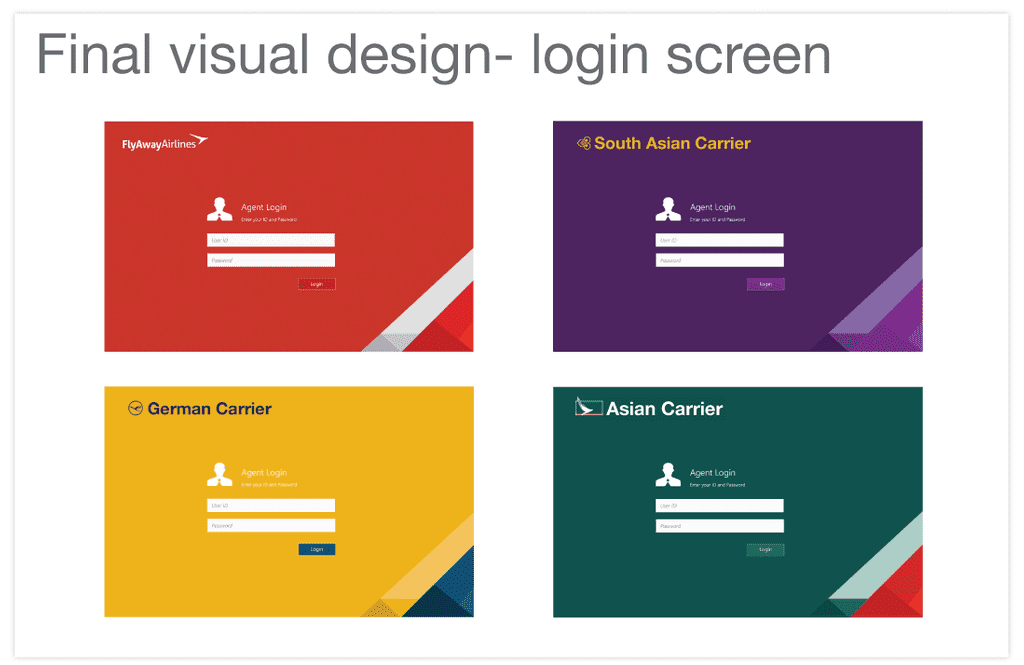
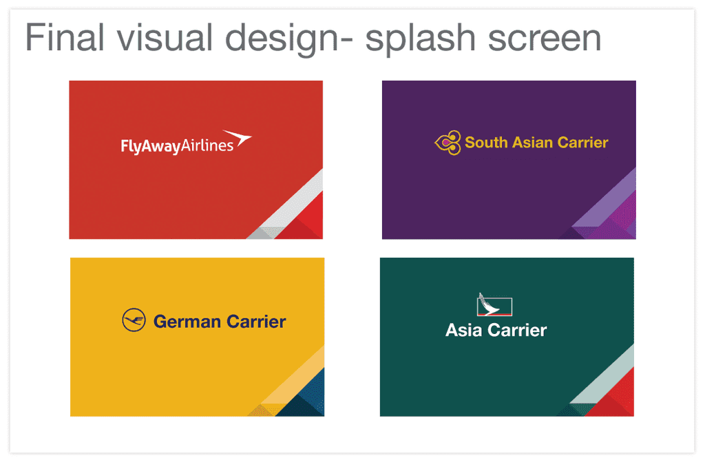
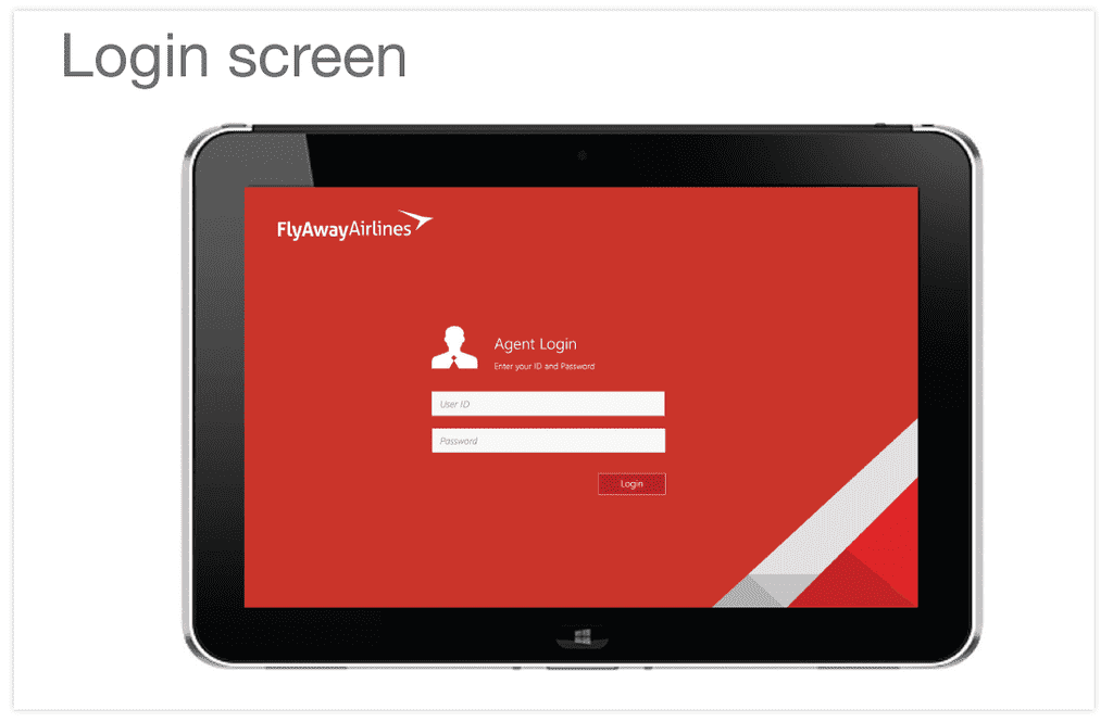
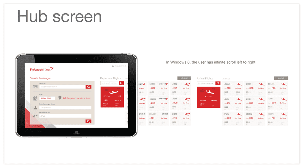
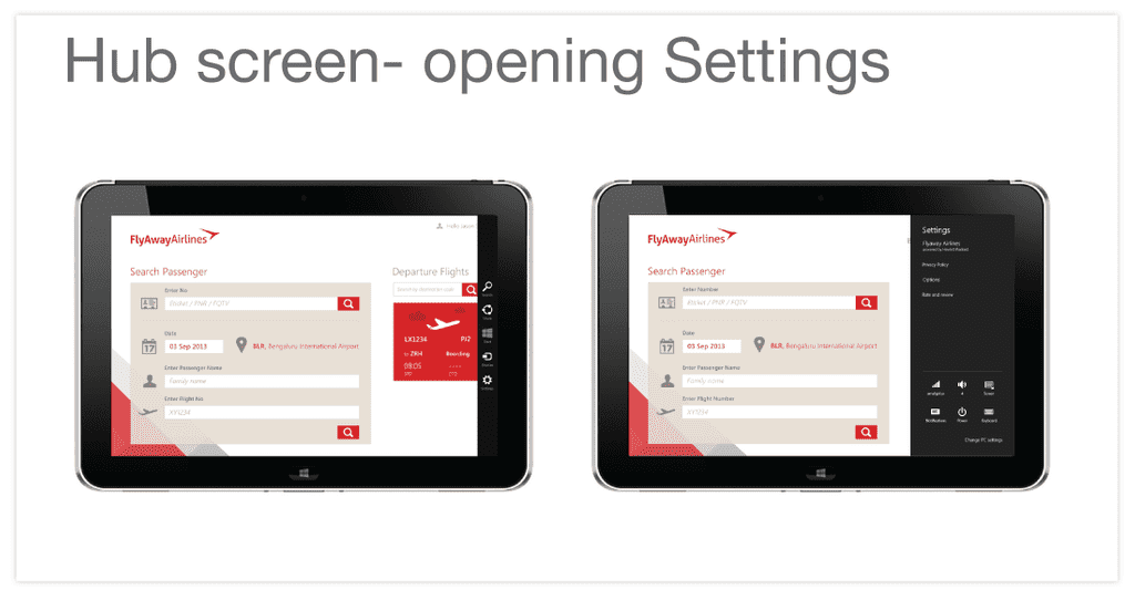
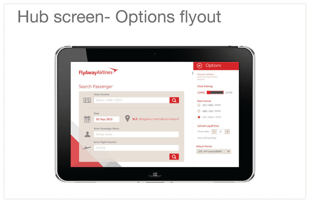
The team selected a visual design language based on shapes and colors from public travel sites and mood boards. Here are a few of the screens for each.
Login Screen
Splash Screen
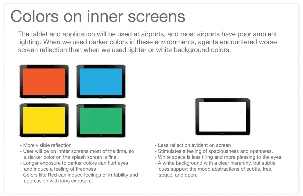
Colors Used On Inner Screens
Login Screen
Hub Screen
Hub Screen with Settings Open
Hub Screen with Options Open
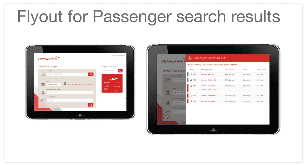
Flyout for Passenger Search Results
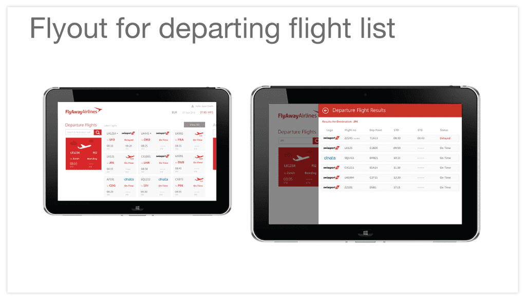
Flyout for Departing Flight List
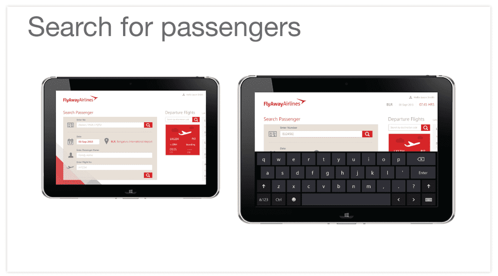
Passenger Search Screen
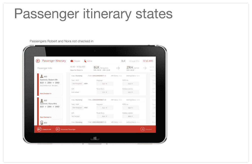
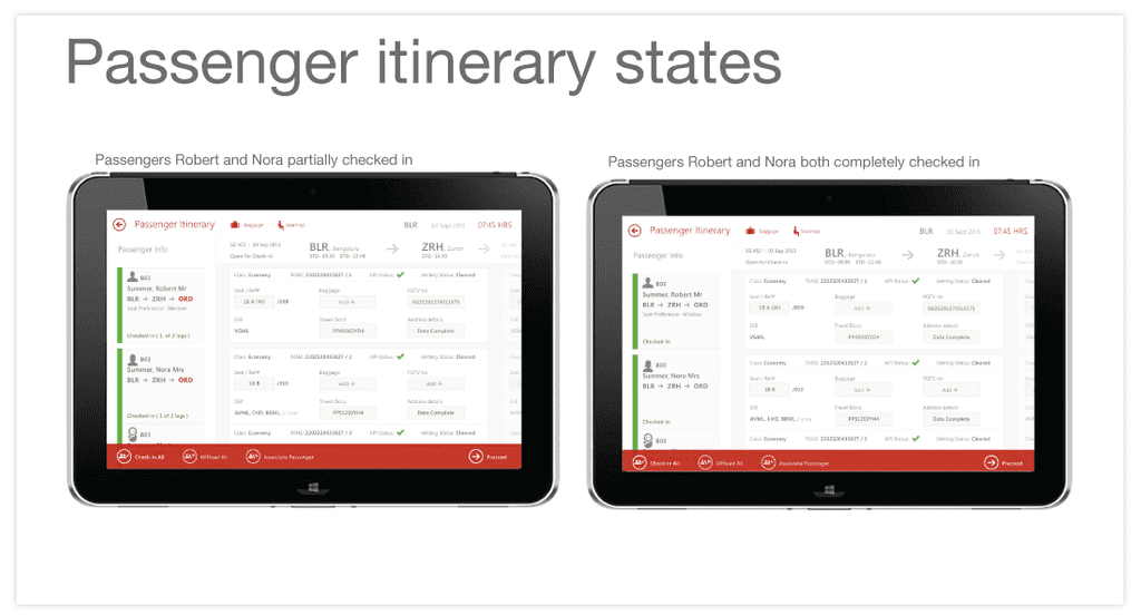
Visual Design for Passenger Itinerary States
Passenger Itinerary States with Passenger Partially Checked In versus Fully Checked In
We decided that it was critical to highlight different states in the visual design, including showing for example passengers who were not checked in versus partially checked in versus fully checked in. This screen highlights partially versus fully checked in passengers.
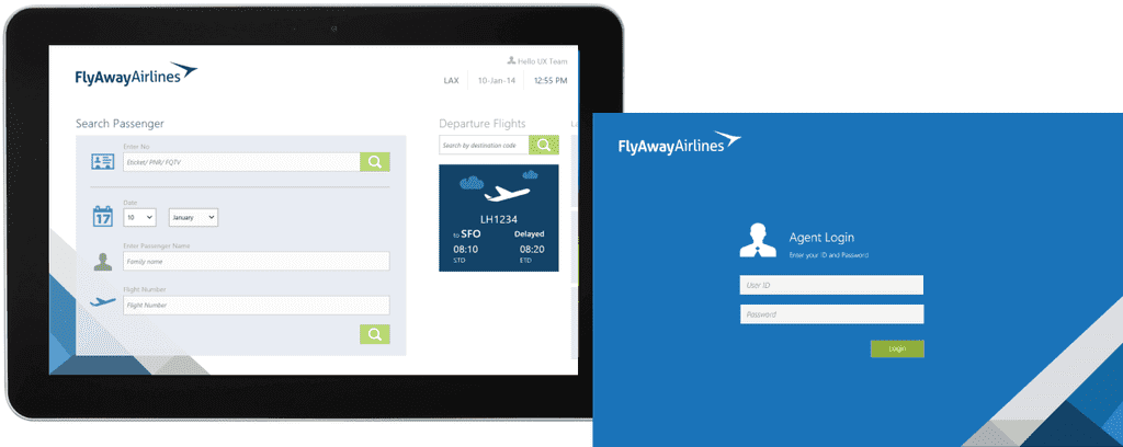
In the end, we received almost no funding to actually build this application. Therefore, I worked with six developers to build this application in approximately six months, including connecting it to the back end. Here is an example of the same application branded blue:
As always, if you have questions or input, please let me know. I'm happy to talk.
